Analysing Open Data from the Canadian Government with Python
I am a business analyst who wants to do a better job on process monitoring and improvement. This is why I became interested in data analysis and started doing some courses on data science with R Coursera Courses on Data Science and Python Coursera Course on Applied Data Science with Python.
To test what I have learned with a new example, I have defined the following research question: What is the percentage of approved Labour Market Impact Assessments out of requested work positions by province and for the country from 2008-2015?
The page on Temporary Foreign Worker Program 2008-2015 has several publicly accessible datasets. My analysis focuses on the years 2008-2015, but as this page is often updated, you may find datasets with more recent data than 2015. Looking trough them, I selected two related datasets, stored in CSV file. Both datasets are on the number of temporary foreign worker (TFW) positions by province/territory. The first dataset has positive Labour Market Impact Assessments (LMIAs) and the second one has requested Labour Market Impact Assessments (LMIAs).
Before looking into the data, you can access the entire source code and run it either using the Jupyter Notebook or set up the environment with the Python IDE PyCharm following these steps:
- Go to the folder where the file is located:
cd data-science - Create a virtual environment where I installed the libraries needed for this
specific project:
python3 -m venv venv - Initialise the virtual environment:
source venv/bin/activate - Install the libraries:
pip install pandas - In PythonCharm, use this virtual environment by editing the Run/Debug configurations and choose the virtual environment as Python Interpreter.
Explore the data
When starting the analysis, the first step is to explore the data. For that, I
read the CSV files using the read_csv function from the pandas
library.
The first lines are to import the libraries:
import pandas as pd
import matplotlib.pyplot as plt
Then, read the CSV file from a url:
def read_open_data_approved_LMIAs():
    url = "http://www.edsc-esdc.gc.ca/ouvert-open/bca-seb/ae-ei/2008_2015_Table_1_e.csv"
    approved_LMIA = pd.read_csv(url, engine='python')
    return approved_LMIA

def show_original_data():
    approved_LMIA = read_open_data_approved_LMIAs()
    print(approved_LMIA)

show_original_data()
When you look at the dataset, there is a header and a blank line and some explanations in the footer. Here’s an extract:
Number of temporary foreign worker (TFW) positions on positive Labour Market
Impact Assessments (LMIAs), by province/territory  \
0                                                 NaN
1                                  Province/Territory
2                           Newfoundland and Labrador
3                                Prince Edward Island
4                                         Nova Scotia
5                                       New Brunswick
6                                              Quebec
7                                             Ontario
8                                            Manitoba
9                                        Saskatchewan
10                                            Alberta
11                                   British Columbia
12                                              Yukon
13                              Northwest Territories
14                                            Nunavut
15                                             Canada
16                                             Notes:
17  1. Employers may only submit one LMIA applicat...
18  2. The data provided in this report tracks tem...
19  3. The numbers appearing in this release may d...

  Unnamed: 1 Unnamed: 2 Unnamed: 3 Unnamed: 4 Unnamed: 5 Unnamed: 6  \
0         NaN        NaN        NaN        NaN        NaN        NaN
1        2008       2009       2010       2011       2012       2013
2       1,386      1,464      1,119      1,537      2,957      3,327
3         583        772        981        848      1,121        876
4       2,714      3,623      3,493      3,960      3,238      3,049
5       1,781      1,527      1,784      2,500      2,322      1,656
6      13,424     16,213     14,091     14,575     15,347     17,509
7      64,210     48,779     49,711     48,053     50,013     43,247
8       4,024      2,815      2,151      2,414      4,420      3,135
9       3,710      3,450      2,649      4,189      9,733      8,518
10     74,462     32,508     43,967     51,018     82,039     56,637
11     40,339     22,576     21,620     22,898     27,934     24,588
12        343        117        137        160        251        219
13        385        122        180        187        266        235
14         88        126        129         82         89         39
15    207,449    134,092    142,012    152,421    199,730    163,035
16        NaN        NaN        NaN        NaN        NaN        NaN
17        NaN        NaN        NaN        NaN        NaN        NaN
18        NaN        NaN        NaN        NaN        NaN        NaN
19        NaN        NaN        NaN        NaN        NaN        NaN
More attributes are added to the read_csv function to skip the two first rows,
4 lines in the footer and change the thousands separator to comma.
def read_open_data_approved_LMIAs():
    url = "http://www.edsc-esdc.gc.ca/ouvert-open/bca-seb/ae-ei/2008_2015_Table_1_e.csv"
    approved_LMIA = pd.read_csv(url, skiprows = 2, skipfooter = 4,
                                thousands=',', engine = 'python')
    return approved_LMIA

def show_useful_data():
    approved_LMIA = read_open_data_approved_LMIAs()
    print(approved_LMIA)

show_useful_data()
Here’s an extract of the dataset:
Province/Territory               2008    2009    2010    2011    2012    2013  \
0   Newfoundland and Labrador    1386    1464    1119    1537    2957    3327
1        Prince Edward Island     583     772     981     848    1121     876
2                 Nova Scotia    2714    3623    3493    3960    3238    3049
3               New Brunswick    1781    1527    1784    2500    2322    1656
4                      Quebec   13424   16213   14091   14575   15347   17509
5                     Ontario   64210   48779   49711   48053   50013   43247
6                    Manitoba    4024    2815    2151    2414    4420    3135
7                Saskatchewan    3710    3450    2649    4189    9733    8518
8                     Alberta   74462   32508   43967   51018   82039   56637
9            British Columbia   40339   22576   21620   22898   27934   24588
10                      Yukon     343     117     137     160     251     219
11      Northwest Territories     385     122     180     187     266     235
12                    Nunavut      88     126     129      82      89      39
13                     Canada  207449  134092  142012  152421  199730  163035
The visual graphic to address the research question
This visual addresses the research question by showing the percentage of approved Labour Market Impact Assessment (LMIA) out of the requested by province and for the country considering the years from 2008 until 2015.
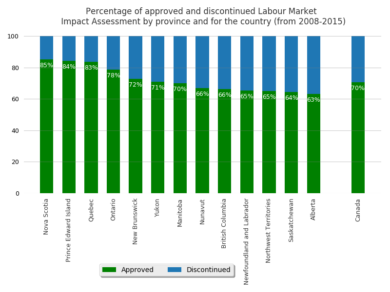
The datasets were selected from the Open Data Initiative website of the Government of Canada. For the understanding of the analysis, as stated on the website of the Government of Canada, it is important to know that not all positions on an approved LMIA result in a work permit or Citizenship, which are subject to other statistics.
This analysis takes the annual LMIA statistics per province and for the country from 2008 until 2015. First, the two selected datasets are merged, one for requested LMIA and the other for approved ones. The annual values are summed up, calculating the total of approved and total of discontinued ones. The discontinued are calculated from the difference of total of requested minus the total of approved. Discontinued can represent different outcomes, such as rejection, withdrawals, etc. The percentages are then calculated to display the approvals in the visual in descending order, starting with provinces having higher percentage of approvals of LMIA, the aim of the research question.
Compared to the country percentage, there are seven provinces with the same or higher percentage of approvals. The other provinces with lower percentage of approvals are not so much lower than the country average.
Analysis of the visual graphic
I use Alberto Cairo’s principles to analyse my own visual graphic:
1)Truthful For each dataset, requested and approved, the values for each year are summed up to represent the total per province. The requested represents the total, while the approved a percentage from this total of requested. The remaining percentage represents the ones not approved, which can vary in result (e.g. withdrawals, rejection), thus, they represent requests that were discontinued. Once the total of approved and discontinued requests are calculated per province and for the country, the percentage is calculated.
The choice of displaying percentages was done since the difference of quantities between the provinces is substantial. The provinces with lower quantities were not visible, only the provinces with higher quantities. Therefore, the percentages were calculated and displayed in the graph to represent the approvals per province and for the country.
2) Functionality Considering the focus of the research question is on the approval of LMIAs, the visual displays, in each bar, labels with percentage of approvals per province and for the country. To organise the percentage of approval by province, the stacked bar showing both approved and discarded seems to be the most appropriate.
3) Beauty With the purpose of making it captivating and easy to understand, the visual is clean: the fonts with readable size, the colors of the bars were selected to be aesthetically pleasing,the ticks on both the x and y axes were removed, the labels of both axes were not introduced because the title already mentions them, a grid with transparency was put in the background to guide, and the legend was placed on a blank space to make best use of the image space.
4) Insightful The order of bars from province with the highest approval to the lowest aims to make it more memorable and show the results quickly and clearly. For people interested in applying for LMIAs, it should give an ah-ha moment to help quickly identify the provinces with the highest percentage of total of approvals from 2008-2015.
Recent Posts
-
Two Books and an Invitation to Learn about Systems Thinking
-
Books I read in 2025
-
Designing Agentic Systems with People in Mind
-
Using a Process Mindset to Drive Innovation with Agentic AI
-
Is Generative AI Weakening Our Critical Thinking?
-
Embracing the AI Shift: Copilot and the New Era of Work
-
Product Owner and Process Engineer
-
What I read in 2024
-
The Science of Choice
-
Rolling out Enterprise Architecture
-
7 Steps to Create Processes
-
First thoughts on Prediction Machines
-
The woman I am
-
Becoming a Runner
-
Business Process Overview