Analysis of an Infographic according to Alberto Cairo's mechanisms
Alberto Cairo’s work entitled “Reflections on the Challenges and Pitfalls of Evidence-Driven Visual Communication” presents three ways graphics can mislead the reader:
- Hiding relevant data to highlight what benefits us: “cherry-picked” statistics, e.g. show the average to hide that sales were negative in a certain moment.
- Displaying too much data to obscure reality: extreme and unnecessary detail, e.g. showing details that would be better explored with interactive tools, not on a printed page.
- Using graphic forms in inappropriate ways: distorting the data, e.g. truncate Y-axis, hide where X-axis begins, inconsistent intervals in one of the axis, etc.
I’m using these guidelines to analyse and detect issues in my own visual graphics. With examples, the author shows that these mistakes do mislead audiences and creators of data visuals should aim to eliminate or, at least, minimize them.
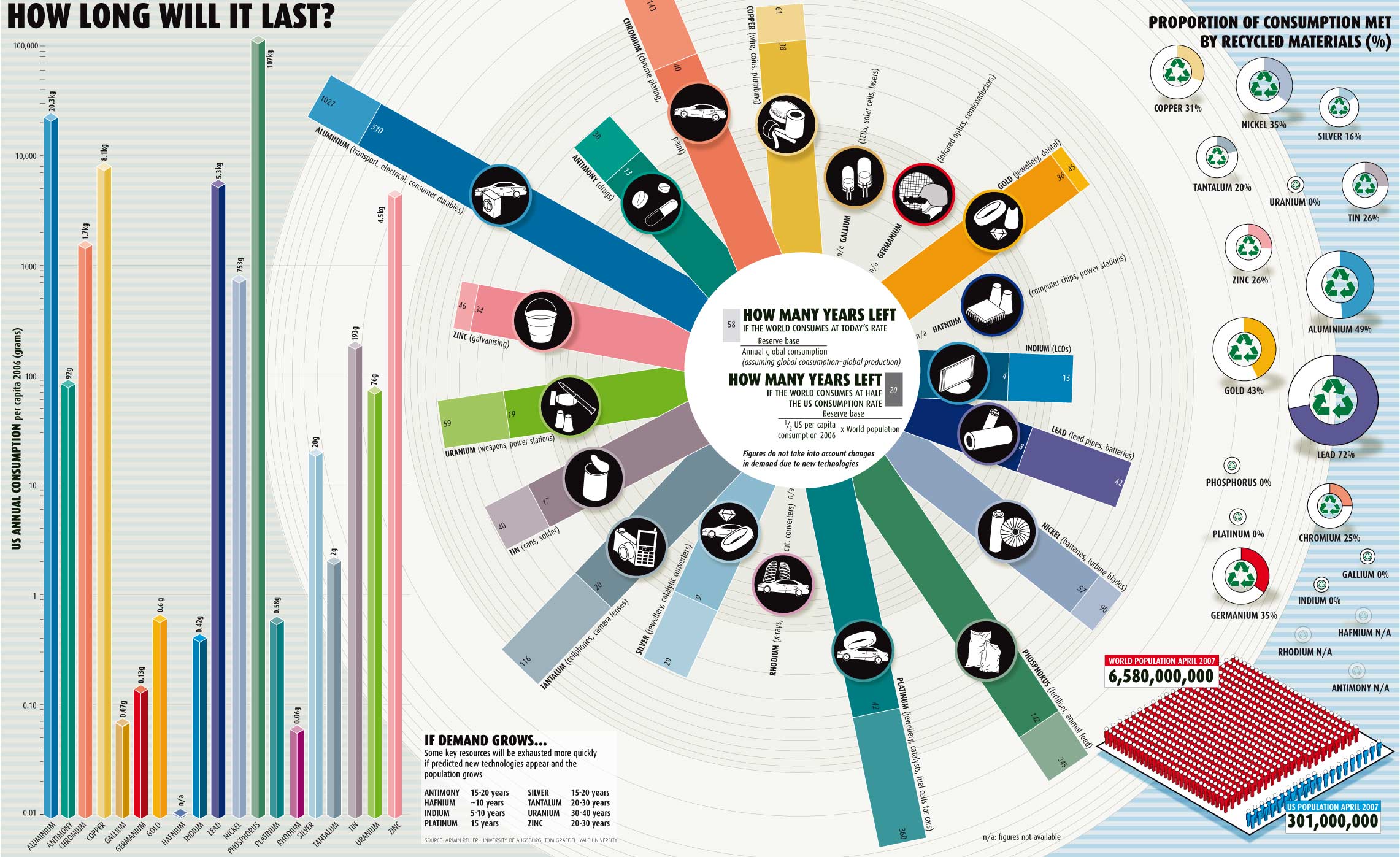
Inspired by this work, I selected an infographic, published at the New Scientist magazine No. 2605 of May 2007, to analyse it according to Cairo’s mechanisms. This visual infographic describes the impact of US and world consumption on the availability of natural resources. It aims to show how long some natural resources would last if the world consumption continues at today’s rate (from April 2007) compared to how long they would last if the world consumed at half the US consumption rate (from April 2007).
The components that I’ve found misleading in the visual are organised by the mechanisms presented by Alberto Cairo’s work:
Hiding relevant data to highlight what benefits us
The visual does not show the data on World population consumption rate, which is used in the calculations of how many years are left for the resources in the graph presented in the middle. Hiding this information can be misleading because the decoder is led to understand that the World consumption is smaller than the US consumption. If the visual also showed a bar graph of the World population consumption per capita, similar to the one on the left, the decoder could better compare these consumptions.
Displaying too much data to obscure reality
There are five data visuals presented:
- bar graph on the left with US annual consumption;
- small table on the bottom next to the bar graph;
- circle graph in the middle that has the key information of the infographics;
- proportion of consumption met by recycled materials;
- population on April 2007 on the bottom right.
Showing these five data visuals in one infographics is misleading because it can
confuse the decoder with unclear links between them. For instance, what is the
relationship between number of years left for a resource (graph 3 in the middle)
and its proportion of consumption met by recycled materials (4 on the right) ?
Another example: What is the relationship between the table (table 2 on the bottom)
and graph 3 in the middle? Is the data from the same source? In the table, the
element “Hafnium” will be exhausted in around 10 years, but there is no figure
available in the chart in the middle.
Using graphic forms in inappropriate ways
The bar graph on the left with US annual consumption uses a different scale, which multiplies units by 10. It can be understood that this scale was used because there is a big discrepancy between the resources being compared. But, in any case, this scale is misleading to the understanding of the decoder who may end up understanding that the difference in consumption is smaller than it actually is. In addition, I could not tell if the scale in the circle graph in the middle is consistent since there is no labelling.
Useful Junk
Looking further into the effects of visual embellishments on understanding of charts, a very interesting article from CHI was recommended to me on Useful Junk. In this article, the main state of the art is on Edward Tufte to eliminate embellishments and on Nigel Holmes to encourage them. The authors report on their experiment results, which shows that there is no difference in interpretation accuracy between embellished and minimalist charts. However, embellished charts actually improved memorability after a gap longer than twelve days.
From my experience, I am in favour of the idea that pictures are worth a thousand words. Embellishments have been useful in my daily work with business processes and statistics charts with great results. Linking back to Cairo’s work, my perspective is that the advantages of embellishments will be more powerful if they are accurate to inform their audiences.
Recent Posts
-
Two Books and an Invitation to Learn about Systems Thinking
-
Books I read in 2025
-
Designing Agentic Systems with People in Mind
-
Using a Process Mindset to Drive Innovation with Agentic AI
-
Is Generative AI Weakening Our Critical Thinking?
-
Embracing the AI Shift: Copilot and the New Era of Work
-
Product Owner and Process Engineer
-
What I read in 2024
-
The Science of Choice
-
Rolling out Enterprise Architecture
-
7 Steps to Create Processes
-
First thoughts on Prediction Machines
-
The woman I am
-
Becoming a Runner
-
Business Process Overview
